Tips for Designing Professional and Stylish Office Notepads
A well-designed office notepad is far more than a functional tool. It is a daily expression of professional identity. It communicates organizational values to anyone who sees it. It reinforces brand awareness with every page used. For businesses that understand the power of consistent branding, the design of office notepads deserves thoughtful attention. This guide provides practical, professional tips for creating notepads that are both highly functional and stylishly distinctive.
Understanding the Purpose of Your Office Notepad
Before diving into design decisions, clarify the primary purpose of your notepad. Will it be used internally by your team? Given to clients as a branded gift? Distributed at industry conferences? The answer shapes every subsequent design decision.
Internal team notepads prioritize functionality and brand reinforcement. Client gift notepads prioritize impressiveness and premium quality. Conference notepads balance portability with visibility. Defining purpose ensures your design serves its intended function effectively.
How Context Shapes Design Priorities
Different professional contexts demand different design priorities. A creative agency's internal notepad might be bold, colorful, and expressive. A financial services firm's client gift notepad should feel conservative, refined, and premium. A medical practice's conference notepad should feel clean, precise, and professional.
Understanding your context allows you to make design choices that feel natural and appropriate. Design that fights against its context feels jarring and unconvincing. Design that aligns with its context feels inevitable and authoritative.
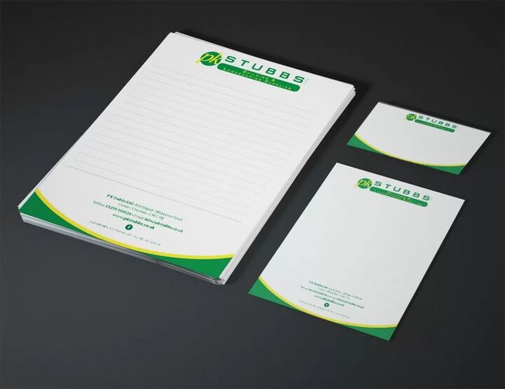
Establishing a Strong Header Design
The header is the most visually prominent and brand-critical element of any notepad. It appears on every page. It is the first element the eye encounters when reaching for the pad. Getting the header design right is therefore the most important design task in notepad creation.
Your logo should appear prominently in the header. Ensure it is large enough to be clearly recognizable but not so large that it overwhelms the entire header area. Logo placement is typically upper-left or centered, depending on your overall brand aesthetic.
Incorporating Brand Colors Effectively in Headers
Brand colors in your header create immediate brand recognition. Use your primary brand color as the dominant header color. Accent colors can appear in secondary design elements like rules, dividing lines, or typographic treatments.
Ensure sufficient contrast between header background colors and any text elements. Dark backgrounds work well with light typography. Light backgrounds suit dark typography. Poor contrast makes headers feel unprofessional and creates readability problems.
Typography Choices for Professional Notepads
Typography establishes the personality of your notepad design. The fonts you choose communicate whether your brand is formal or casual, traditional or modern, conservative or creative. Choose fonts that align with your established brand typographic system.
Consistency with your existing brand typography is paramount. Use the same primary font that appears in your other branded materials. This consistency creates seamless brand recognition across all your professional touchpoints.
Sizing Typography for Clarity and Impact
Display text in your header should be sized for immediate readability. Contact details, if included, should be smaller but still clearly legible. Body area typography, if you include printed elements beyond the header, should prioritize legibility above all else.
Avoid overly small type in any section of your notepad design. Tiny type looks cluttered and feels unprofessional. When in doubt, increase size and add spacing. Generous type sizing signals confidence and clarity in your brand communication.
Paper Selection for Quality and Performance
Paper quality is the foundation of a great notepad experience. The feel of paper beneath a pen or pencil is an immediate quality signal. Premium paper creates a premium writing experience. That premium experience becomes associated with your brand.
For professional office notepads, choose paper weights between 50lb and 70lb text. Heavier paper reduces bleed-through from ink pens and markers. This practical benefit keeps notes clean and readable on both sides of each page.
Surface Texture and Writing Performance
Paper surface texture affects both writing performance and print quality. Smooth surfaces provide the most comfortable writing experience with all pen types. Lightly textured surfaces feel more tactile and distinctive. Very rough surfaces can impede smooth writing.
For notepads that will be used with fine-tip pens or pencils, slightly textured surfaces can feel luxurious. For general office use with ballpoint pens, smooth surfaces provide the most reliable and comfortable writing experience.
Printing Options for Custom Notepads
Professional printing elevates notepad design dramatically. The quality of color reproduction, the crispness of logo rendering, and the consistency of print quality across the entire pad all depend on working with skilled printing professionals.
For businesses serious about brand presentation, investing in custom notepad printing through professional services produces results that internal printing simply cannot match. Commercial printers offer color accuracy, paper variety, and finishing options unavailable to standard office equipment. The resulting product looks and feels genuinely professional.
Binding Options and Their Professional Implications
The binding method affects both the functionality and appearance of your notepad. Glue pad binding, where pages are glued at the top, is the most common and cost-effective option. It works well for standard office use.
Wire spiral binding creates a more substantial feel and allows pages to fold completely back. This works well for larger notepads used in meetings and presentations. Sewn binding creates a premium, book-like quality for luxury gift notepads. Choose binding based on how your notepad will primarily be used.
Size and Format Considerations
Notepad size should match its intended use context. Small note pads work well as desk accessories and pocket reference tools. Standard letter size works well for meeting notes and detailed planning. Custom sizes can be distinctive but should still be practically functional.
Consider how your notepad will be stored and transported. A size that does not fit standard desk organizers, folders, or bags creates practical inconvenience. Practical inconvenience reduces usage. Reduced usage means fewer brand impressions. Function should always remain in balance with distinctive design.
Ruling Formats for Different Professional Needs
Ruling format significantly affects daily usability. Blank pages suit those who prefer free-form notes, sketches, and diagrams. Standard ruled lines suit those who prefer organized written notes. Dot grids suit design and technical professionals who need flexible structure.
You might consider offering different ruling formats for different recipient groups within your organization or client base. Matching the format to the user's actual working style ensures maximum usage and appreciation.
Adding Functional Design Elements
Beyond the header and basic page layout, thoughtful functional design elements can elevate your notepad significantly. Date lines at the top of each page help users organize notes chronologically. Page numbers help locate specific notes within the pad. Action item indicators or priority markers can transform simple notepads into productivity tools.
These functional additions create additional brand touchpoints within each page. They also increase the practical value of the pad, encouraging more consistent use. A pad that is genuinely useful gets used fully. A fully used pad creates maximum brand impressions.
Including Contact and Brand Information Subtly
Including your website, phone number, or social handles in your notepad footer creates a subtle call-to-action on every page. Keep this information small and understated. The goal is availability without intrusiveness.
When recipients tear out a page to share, your contact information travels with it. This organic information-sharing extends your brand reach naturally. A client sharing a note from your branded pad inadvertently promotes your business. This passive brand extension is a genuine marketing benefit.
Quality Control Before Final Printing
Before committing to a full print run, always request a printed proof of your notepad design. Digital proofs on screen do not accurately represent how colors will appear in print. Physical proofs reveal color shifts, scaling issues, and layout problems that screen review misses.
Review proofs in the actual lighting conditions where the notepad will be used. Natural and artificial light can render colors quite differently. Ensure your brand colors appear accurately and that all text elements are clearly legible. Only approve a final print run when you are fully satisfied with the physical proof.
Managing Consistency Across Multiple Print Runs
If you reorder notepads regularly, maintain consistency across print runs. Keep your original design files carefully archived. Note the specific paper stock, binding method, and printing specifications from successful runs.
Color consistency between runs requires attention. Slight variations in paper stock or ink formulation can shift color appearance. Working with the same print provider consistently reduces variability. Consistency in physical brand materials builds the trustworthy, reliable brand image all businesses should pursue.
Conclusion
Designing professional and stylish office notepads requires attention to purpose, design principles, material quality, and printing excellence. Every decision, from header design to paper weight to binding method, contributes to the final impression your notepad makes. When executed well, a branded office notepad becomes a daily ambassador for your professional identity. It earns its place on desks by being genuinely useful. It earns its place in your marketing strategy by delivering consistent, long-term brand impressions at exceptional value.